‘MYOUSIC’ Marketing Campaign
American Marketing ASsociation
(2020)
The American Marketing Association Cal Poly SLO chapter held their annual Marketing Career Conference in February of 2020. I was a contestant in the Creative Showcase competition where students were tasked to ideate or rebrand a marketing campaign. I took this opportunity to create a music streaming service that truly valued the user’s individuality and enhanced the social experience of music sharing. Winning 2 out of the 3 categories, I was able to impress professionals to show my immediate value.
ABSTRACT
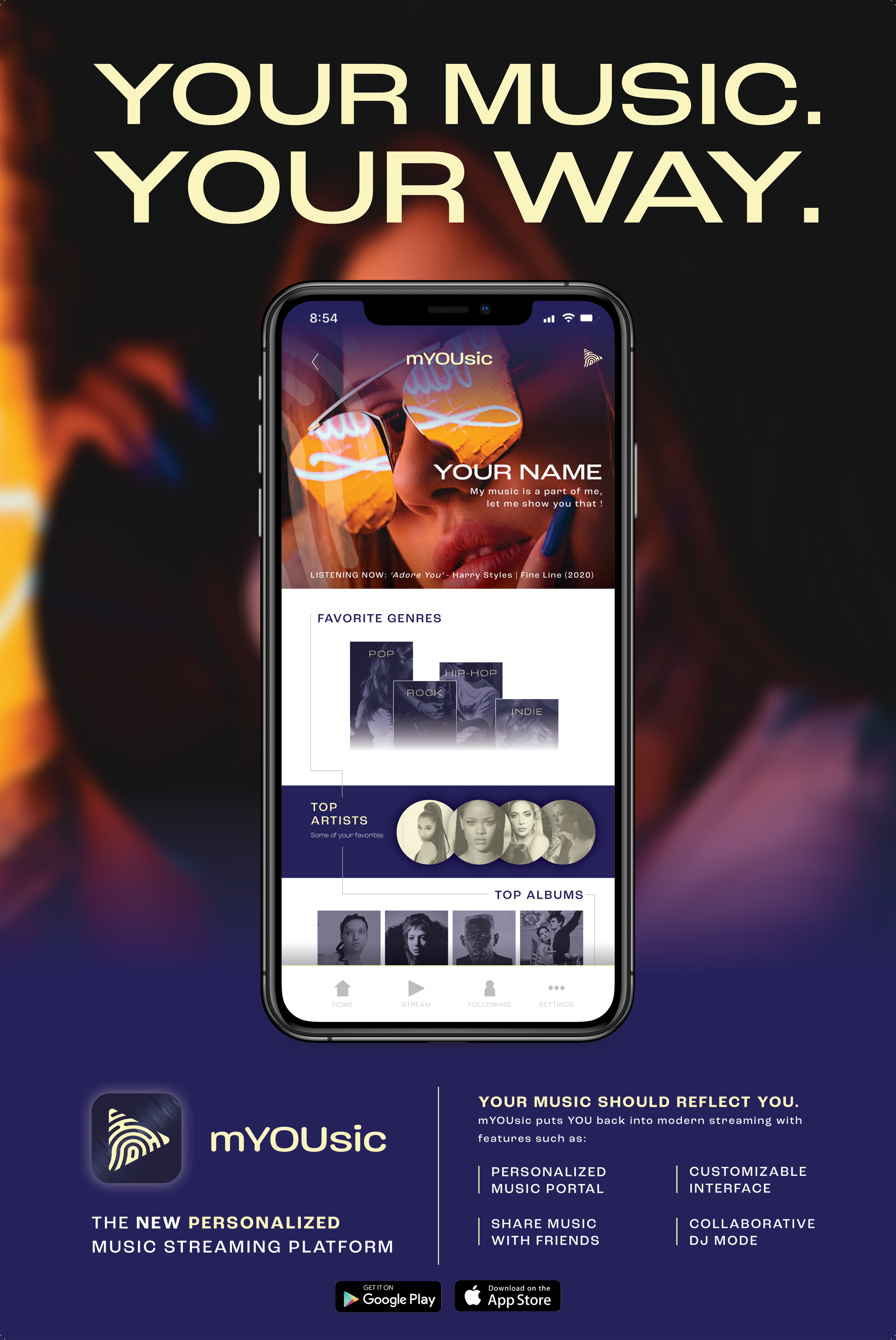
In the age of music streaming, it is vital to preserve the excitement and uniqueness that comes with enjoying music. The large streaming giants of today, namely Apple Music and Spotify, serve their purpose well for a streaming service, but can vastly improve to augment user engagement and experience. The mission that is set with ‘mYOUsic’ is to emphasize the listener beyond simple user music curation. Opting for a more simple and to the point name, the consumer can understand the concept fairly quickly. Many brands are now embracing a purposeful misspelling as their new way to grab attention and explicate uniqueness. There are many key features to this streaming service to differentiate amongst competitors and secure a viable strategic competitive positioning.
FEATURES
SOCIAL EXPERIENCE
Moreover, many listeners enjoy sharing their music and other social aspects of current competitors but they are never the main focus of the services. With sharing capabilities, users can easily share music to their followers, friends, and more. This can also introduce a Following Feed/Timeline to show follower activity also in relation to the user’s own activity. This can be things like music taste matches, similar playlists, and etc. For an even greater group listening experience, introducing the collaborative DJ mode allows users to democratically determine the flow of the session.
LISTENER ENGAGEMENT
Part of the mission of enhancing listener engagement is by allowing the user to fully personalize their profile to feature music statistics that build up their musical taste. Similar to the year-end reports of Apple Music or Spotify that many listeners enjoy getting reviewing and sharing their personalized music trends. Having this be an all-year round feature can be highly encouraging of users to keep using the app to build up their profile.
ACCESSIBILITy
Additionally, an issue that competitive streaming services don’t often address is accessibility in the interface. Many of the larger players in the industry don’t have many customizable interfaces and are more static and can be only the two extremes of light and dark and no room for inclusive accessibility user interface design features.
DESIGN
For the design of the campaign, I made screens to showcase how each of the features would be potentially implemented. Using large (free stock) image hierarchy the viewer can see the intended context of the product. The incorporation of the fingerprint motif in the play logo and designs is to explain the emphasis of the individuality of the user in the app. Using a familiar color scheme for a streaming service drives familiarity but also enables dynamic layouts.
TARGET AUDIENCE
For the target audience, it can be very open since there are all kinds of music consumers. One segment in particular that would be most beneficial to market towards would be young adults. Many young adults today are constantly bonding over music, going to music festivals, hosting listening parties, and particularly enjoy getting to know their own musical trends and stats. They are also a large part of the consumers of the competitors services.

FIRST PLACE
BEST LOGO/BRANDING &
AUDIENCE CHOICE BEST MARKETING COLLATERAL
Judged by professionals from Adobe, Hathway, Apartment list, and an audience of 100+ attendees.


